Optiek De Laet is a family-owned business from Chapels. Earlier this year, it was taken over by Steven De Laet. The interior was completely redone and with that comes a new, fresh house style with a vision to go with it.
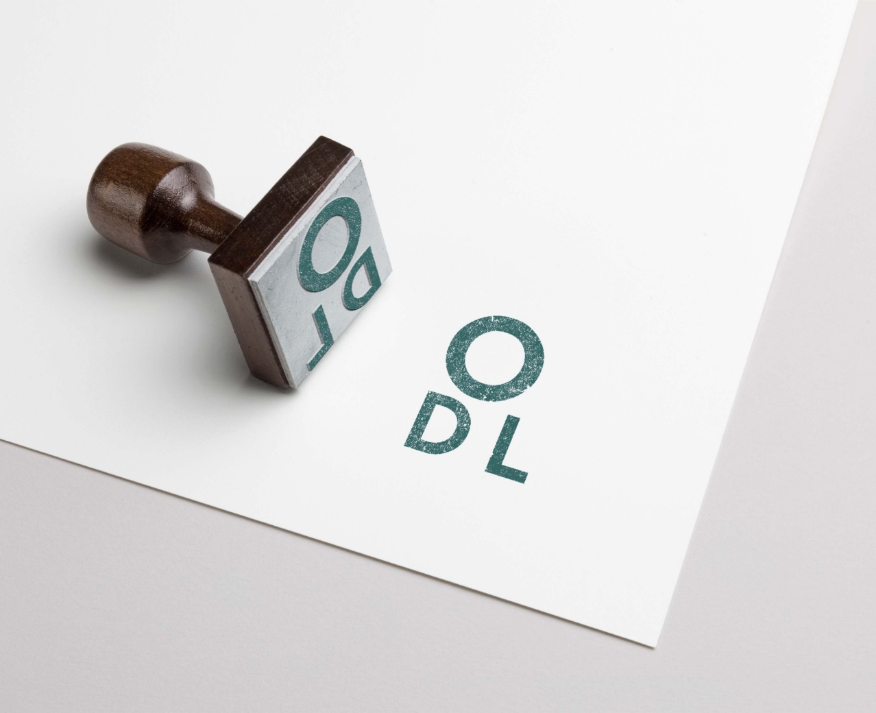
For the new corporate identity or rebranding, colors were chosen that match the interior design and exude simplicity and quality. Initials inspired by eye tests form the wordmark. To spice up the communication, we use graphics with bright colors and dynamic images.

The original logo and its updated version reflect the evolution of the brand. Playful, dynamic icons with bright colors give the graphic design
an extra dimension and creates a clearly recognizable style.
A modern typeface combined with the color palette and imagery provide coherent communication. The compact logo and icons work great for digital applications such as social media channels, newsletters and the (mobile) website.
In addition to the rebranding we also created a new website set up where products can be ordered in a user-friendly way through an online shop. The mobile-friendly website also allows you to make an appointment online.
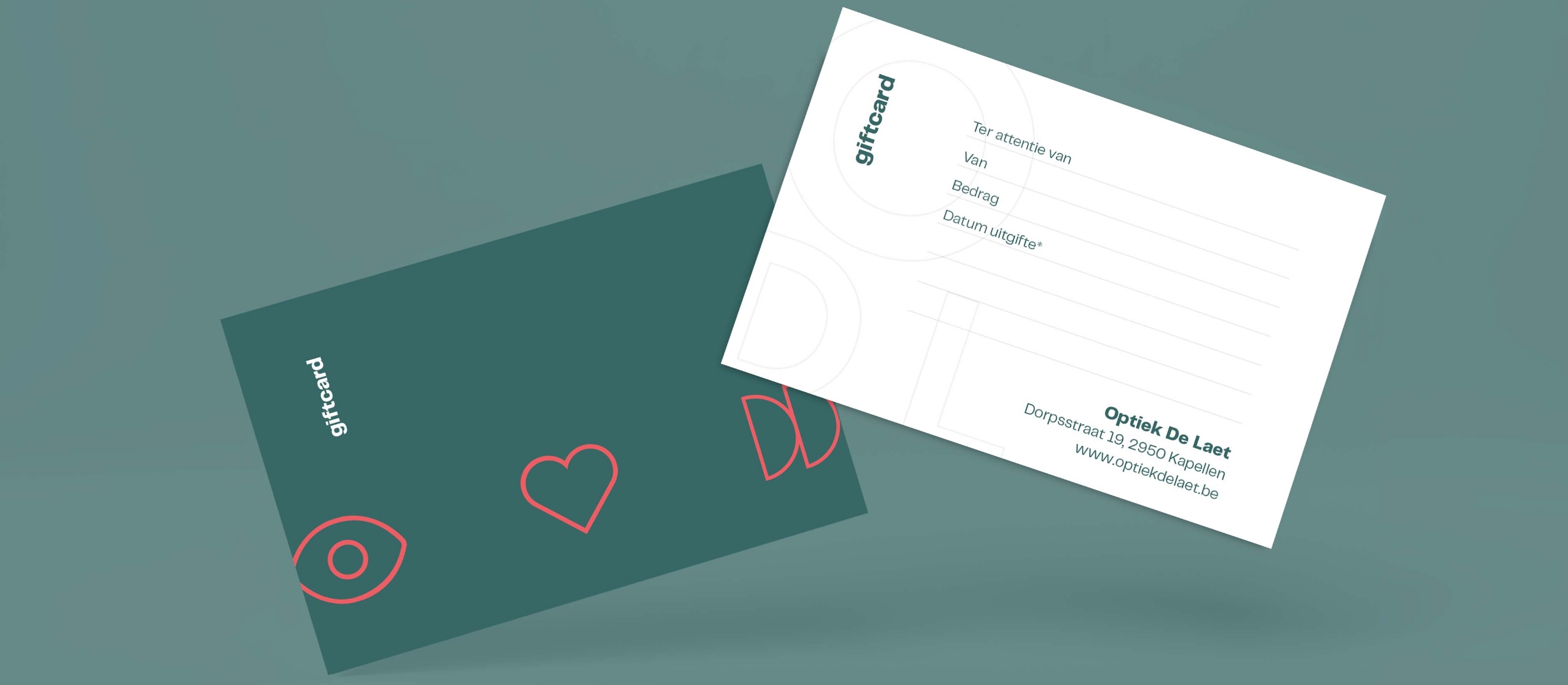
Here are some applications of the new branding where we work with the colors and shapes to convey the message in a clear way.
