Not just any communications agency.
Pantarein is a strong and up-to-date communications partner with a vision for the future. They focus on supporting clients setting up sustainable projects.
Designaid was brought in to develop from an objective point of view the corporate identity rethink based on the baseline “We build sustainable stories. To this end, our team, composed of Andrea Paolini and Julien Merlin, worked closely with Pantarein to ensure that this message was portrayed in the right way.
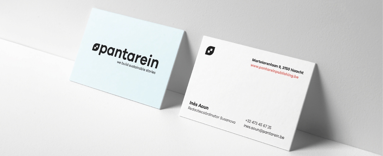
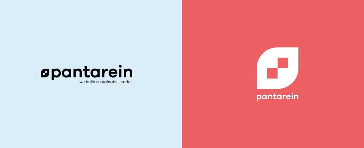
We simplified the name and combined it with a dynamic logo. Along with the rebranding, we simultaneously launched a new website
launched.

Guidelines
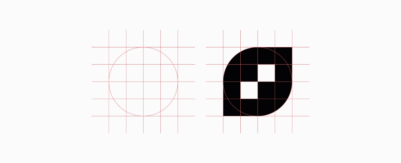
The logo design is composed of the three building blocks of the identity; build – sustainable and stories. The icon in the form of a leaf represents sustainability containing the building blocks for a strong story.
We chose a fairly recent Sans Serif font with distinct colors without being too bright. Corporate identity is a balance between the message being delivered and the strong images that confirm the message.
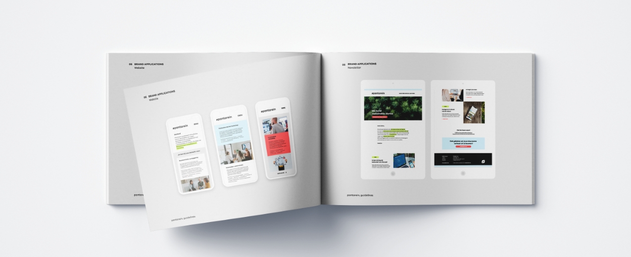
The application of the logo and corporate identity was compiled into a corporate identity guide, also called guidelines, for consistent use.

Web design
With a new house style naturally requires a website
that continues the line of the rebranding. To do this, we started with the aspects of usability and mobile as the main guidelines for the structure.
Clear -and well-organized navigation provide a pleasant experience both on desktop and mobile applications. The site is set up in WordPress, making it easy for its administrators to manage. In addition to the website, work has been done on a newsletter template that can be managed through Mailchimp.
